


Our Journey to Becoming Data Analysts - Project 4
San Francisco Airport Operational Analysis


Table of contents
> "Ladies and gentlemen, welcome onboard Flight DataLoverz with service from Us to You. We are currently four weeks into the Bootcamp. We ask that you please fasten your seatbelts at this time and pay attention for the duration of this weeks report."
Hola! Hashnoders. Hope you are feeling good cause we most definitely are. We just completed another project and as usual, we are here to tell you all about it. This week's project was quite an interesting one and at the same time extremely difficult to get done but, trust your beloved team to always get over the finish line with amazing results and ahead of schedule.
The Process
The task required us to work on Airport Operational Performance Analysis for Airports. We remember after the task was dropped, everyone was shocked! (As in e shock us). It was long, and looked like it would be harder than the former tasks. Eventually, we got it.
The Steps
- Data Search/ Scraping
- Data cleaning
- Visualisation
- Drawing of insights
Before we go deep into the details, quick question. How long do you think we spent searching for data? okay okay, loving your ideas. We spent 4 days searching for data. When we found out that the necessary metrics needed to be visualised were changed, we were elated!. We got to the cleaning of Data in Excel. The group in charge of Data Cleaning took this up, the lead being the Team Lead. They saw to it that the data sets were cleaned out, values that needed to be replaced were replaced, everything needed to be removed was removed and when done, they sent the clean data to the Visualisation team.
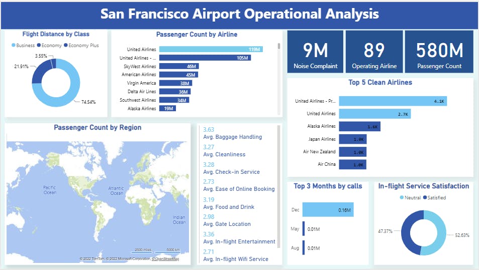
The Visualisation team got to work by loading the Data to Power Query, adjusted the data where necessary and after, began working on the data in Power Bi. The end result is the picture you see below. We displayed 9 metrics through the visualisation. We decided to go with these colours because when you think aviation, the sky may come to mind asides aircraft and other vessels for air transportation. And so that is why the dominant colour in the visualisation is Blue.
Insights
- Business class accounts for the majority of Flight Distance .
- United Airlines and United Airlines - Pre 07/01/2013 have noticeably more passenger count .
- United Airlines and United Airlines - Pre 07/01/2013 also tops the majority of clean Airlines.
- December happens to be the month with the most number of callers reporting Airplane noises.
- 53% of Passengers are satisfied with the in-flight service .
Click the link below to access the dashboard on Power Bi service
Link to dashboard
app.powerbi.com/links/7RvmhusvSN?ctid=23c3d..
Just as we said in our last post, we would love for you to meet more members of the team
- hashnode.com/@Adewalescrib :Nurudeen Babalola aka Adewalescrib (our honourable Team lead)
- hashnode.com/@Ayowande :Anuoluwapo Mokuolu aka Wandy (The Assistant Team Lead)
hashnode.com/@Adebola2011 :Safrah Omisanya aka Bolaaa (Punctuality mama)
hashnode.com/@Tioluwanimi: Toluwanimi Akinwunmi (Master Finder)