Photo by Ian Schneider on Unsplash
Our Journey to Becoming Data Analysts- Project 2 The continued experience..
Table of contents
“Being a student is easy. Learning requires actual work.”
–William Crawford.
It's our second week! Was it better than the first? yes, a whole lot better💃. It wasn't better in terms of workload because the project in itself was challenging, really really, but it was much better in terms of the level of collaboration and communication. Oh and guess what! We made a new friend, her name's YouTube.. You may have heard of her. Well, she's our best friend now.
This week, our project was quite different from the first. We were told to pick 2 diseases/infections from a list of 6. After picking we were to scrap, clean, and visualize the data using Power BI and create a Disease and Infection Monitoring Dashboard. Certain questions were provided which the visuals on our dashboard had to answer. Oh and bonus points for those who could make a live connection between their data and a website. Once we had fully understood the task, we got to work💪. We decided to go with Covid-19 and Malaria as the 2 infections we would work on, and that's when we encountered our first challenge; finding a data set.
Finding Data
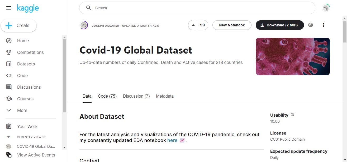
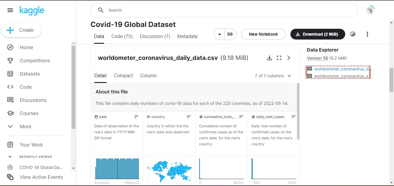
Like the movie 'Finding Nemo' we went through the voluminous ocean of several data just to find the ones that would meet our requirements. We began looking for data but like Nemo, it was nowhere to be found. We struggled for 3 days and on the third day, a Wednesday, we magically encountered 2 golden datasets. One of them was uploaded on Kaggle by Joseph Assaker. When the Team Lead informed us about his successful search, we all lept for joy, we knew now we could get on track.


The Process
For this project, we tried severally to establish a connection between our Power Bi and a web-based data but we were not successful with any of the attempts. We had to come to a conclusion that though we wanted bonus points (which rational student wouldn't), it would be better to work on the data set we already had. That was exactly what we did.
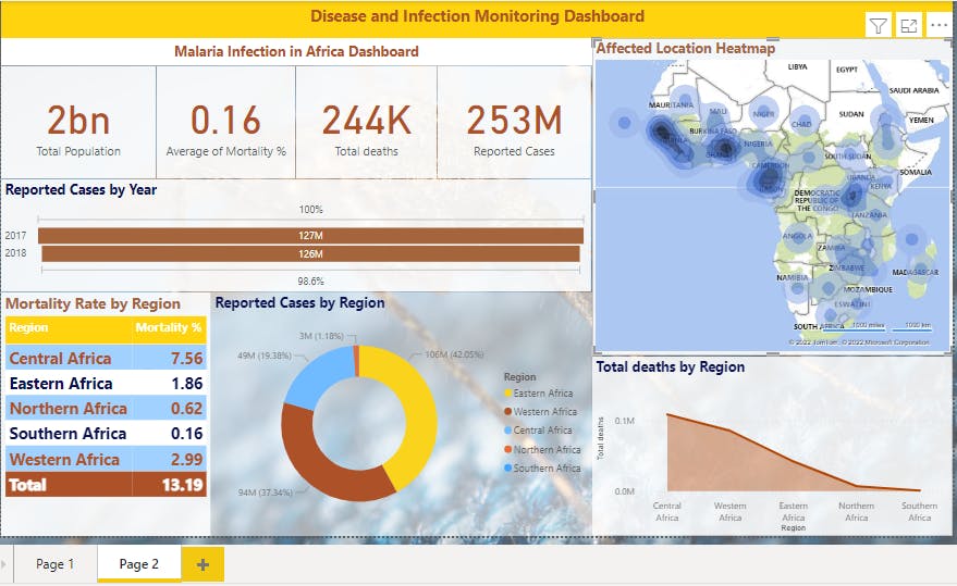
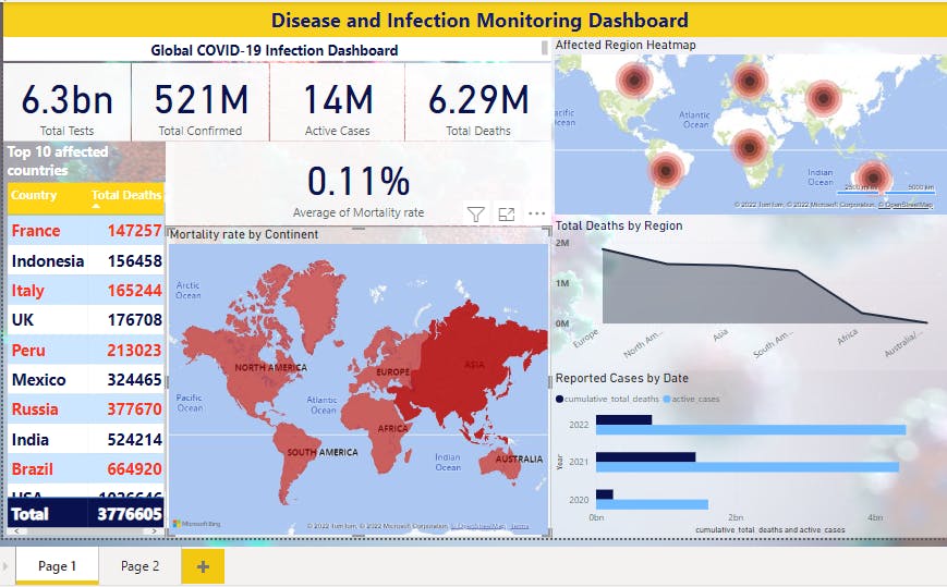
We opened the downloaded datasets in Excel, cleaned them and made a few calculated tables to get the Mortality Rate for each disease. Then when we had finished, we loaded the files on Power Bi, removed duplicates and all unnecessary columns, we also replaced some values e.g 'null' was replaced with '0'. When we had finished it all and we were sure the data sets were ready for visualisation, we loaded it unto Power Bi. We began to attempt to answer the questions asked through our visuals. Our goal was to make a report that was both pleasing to the eye and communicated the information effectively.


After developing the above visuals, we published them on Power Bi service using the account of the Assistant Team Lead.
The Experience so Far
What we have found to be the most challenging aspect is Data Scraping. We noticed that a lot of situations required the knowledge of Python or R in order to scrape the data but generally, we can say we've really learnt a lot. A number of the team members really enjoyed this project as a good number of us have interest in the Health Industry.
The Team's Progress
As a team, we are making a lot of progress. This week we were determined to beat the deadline and finish a day before the submission date and we didd💃. It's beautiful to grow as an individual, but it's much more beautiful growing as a team and possessing an encouraging level of teamwork. We are excited as to what the future holds for us, we really are.
We want you to meet some of the Team members
adewalescrib.hashnode.dev :Nurudeen Babalola aka Adewalescrib (our honourable Team lead)
ayowande.hashnode.dev :Anuoluwapo Mokuolu aka Wandy (The Assistant Team Lead)
adebola.dev :Safrah Omisanya aka Bolaaa (Punctuality mama)
Link to our report: app.powerbi.com/links/sN5IEfBM41?ctid=1bb30..
There you have it hashnoders😊 keep watching this space!

